Importing Certificates into Xcode 27's Device Hub
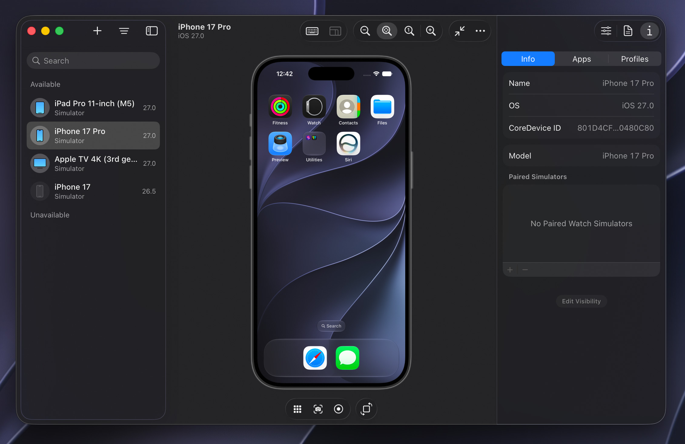
Xcode 27 introduced, among other new features, a new Device Hub app for developers that takes the place of the Simulator app. Where Simulator relied on separate windows for each device, Device Hub brings them all together into a single window where each simulated device is the detail view from a source list of devices on the left. It’s a more organized approach, made necessary by the wide variety of platforms Apple and Apple platform app developers have to build and test against.
For enterprise users or developers building apps that communicate with web services over HTTPS, those services need to be using a certificate pair signed by a globally-trusted authority like DigiCert or Let’s Encrypt for them to work “out of the box” in the simulated OS. If they are using a certificate pair signed by a self-signed or in-house/enterprise CA (Certificate Authority), the OS will refuse to connect, displaying a “This connection is not private” interstitial in Safari or failing with a TLS trust error like NSURLErrorServerCertificateUntrusted. Even if the host Mac has the CA root certificate installed and trusted, the simulated devices rely on their own per-virtual-device trust store.1
In releases prior to Xcode 27, you could resolve this by importing the root public certificate into the simulated OS. On iOS, this could be done by dragging and dropping the .cer file onto the Simulator device window. Nothing would appear to happen, but you could then navigate to Settings, General, About, Certificate Trust Settings and mark the certificate as trusted. On tvOS, the process was even more complex, requiring you to open Settings, General, Privacy & Security, hold down the virtual remote’s Play button on the Share AppleTV Analytics option to bring up a hidden dialog, then enter an HTTP URL to a .cer file. Similar to iOS, you’d have to mark it as trusted by navigating tvOS to Settings, General, About, Certificate Trust Settings and enabling the switch for that certificate. This process was slow and, especially on tvOS, quite obscure.
In Xcode 27 with Device Hub, this process is much more uniform.
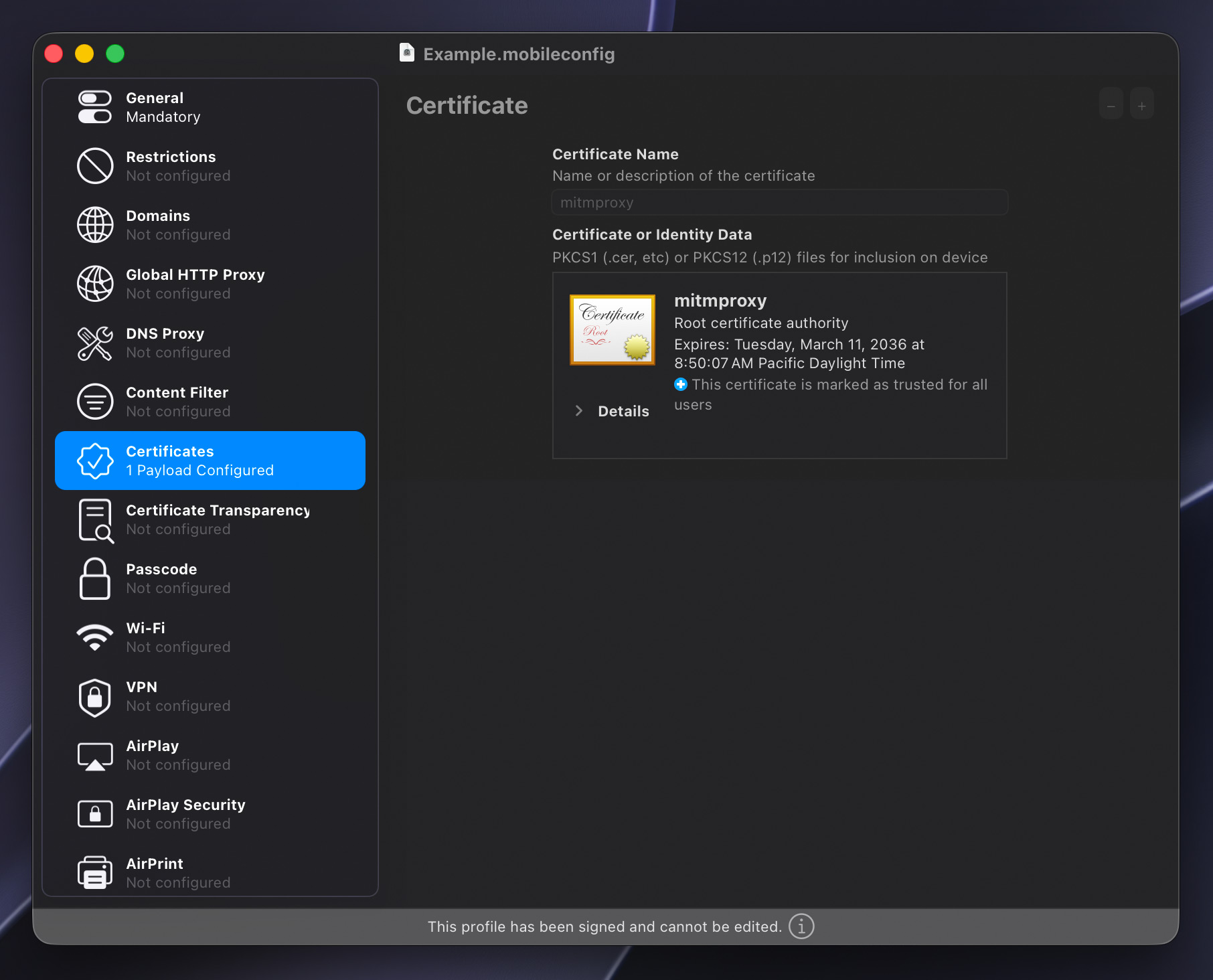
- Open Apple Configurator and create a new profile.
- Under General, give the profile a name, a unique identifier, and perhaps an organization name.
- Under Certificates on the left, click the Configure button and choose the
.cerfile you wish to install into the simulated OS. - From the File menu, choose “Sign Profile…” and select a developer identity to sign with. Alternatively, you can sign profiles from the command line with
security cms -S -N "My Signing Identity" -i unsigned.mobileconfig -o signed.mobileconfig. - In Device Hub, select the target device, then open the Profiles tab in the right-side device inspector.
- Click the plus button below the list and choose the
.mobileconfigfile you just signed. - The profile and its contained certificate should be immediately installed into the simulated OS. In iOS, you can verify by navigating to Settings, General, VPN & Device Management, and on tvOS the list of installed profiles is at Settings, General, Profile.
While this new process does require you to wrap certificates in an Apple Configurator profile, this is much more consistent with how Apple’s device management system works, as it relies on signed profiles with policies, not loose .cer files. And now, just by adding the .mobileconfig to the Profiles section of the device inspector, the embedded certificate is automatically marked as trusted, greatly speeding up installation on new virtual devices.
-
Much like Simulator devices, Xcode’s built-in SwiftUI Previews rely on their own dedicated trust store separate from both the host Mac and Simulator/Device Hub devices, but there’s seemingly no way to configure certificates in that SwiftUI Preview environment. Apple folks, please see
FB10667327. ↩


 Carefully placed spotlights and torches regularly cast Indy’s recognizable shadow.
 Light reveals Indy’s eyes when he’s making a connection or solving a puzzle.
 Just marvel at the level of detail achieved here: The fine individual hair, the wear on the seams of the leather jacket, the distressed fur felt on the fedora, and the specular highlights on the sclera of the eyes.
 Every region has loads to explore, little sub-plots to follow, and NPCs going about their business. Some casually relay details or hints towards as-yet-unsolved puzzles.
 Attention to detail is everywhere in this game. Here, the number of remaining shots in the heads-up display corresponds to the number of visibly unfired rounds in the revolver. The reload animation has Indy individually pluck out spent rounds and replace them, rotating the cylinder for each.
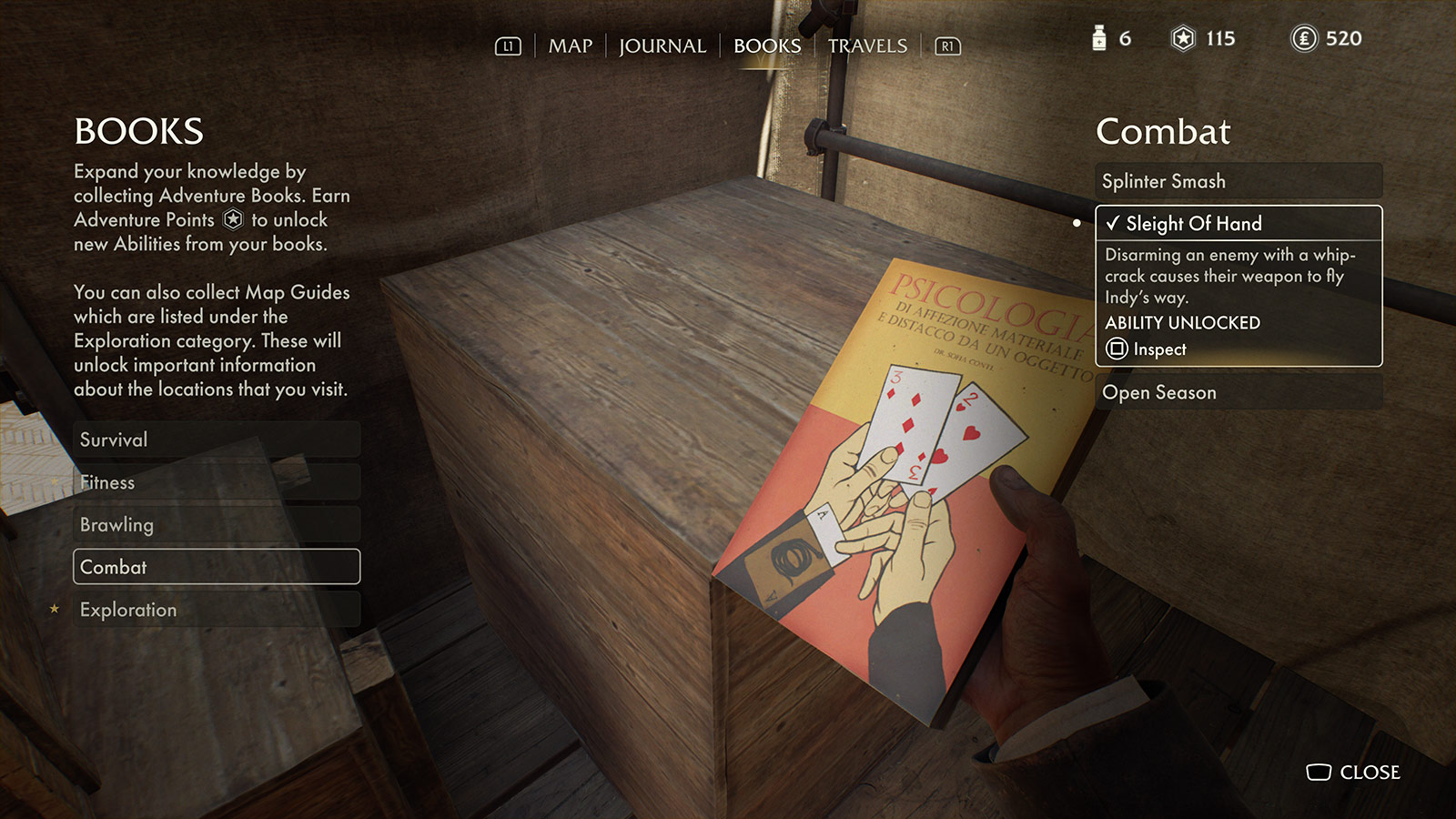 Acquiring and reading Adventure Books boosts combat, survival, brawling, etc.
 Even the Pause menu looks like it belongs. Also, hey, it’s me: I’m