I finally caught up to 2024 and finished playing Indiana Jones and the Great Circle to 100%. I had been putting off starting the game for some time because I’m really not much of a gamer, and I find it oddly difficult to internalize new game control schemes and menu systems. But once I finally picked up the controller, it didn’t take long to get acquainted with the intuitive grip and whip system, and I’m so glad I did, because this game is really something special.
Look and Feel
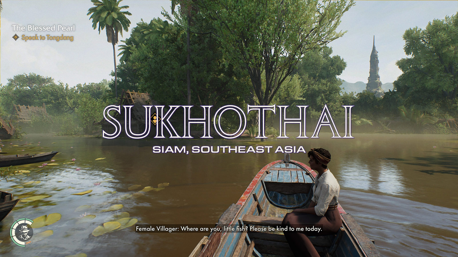
MachineGames did a fantastic job at matching the feel of the source material. The levels are dense with detail, the typography looks just right, and there are both first person in-game and third person cutscene references to the films’ cinematic choices at every turn. Most notably, the use of hard contrasting light and shadow appears fairly often while exploring. Following along with the game’s story feels like enjoying a lost installment from the original trilogy, which is a bar I didn’t expect it to clear going in.
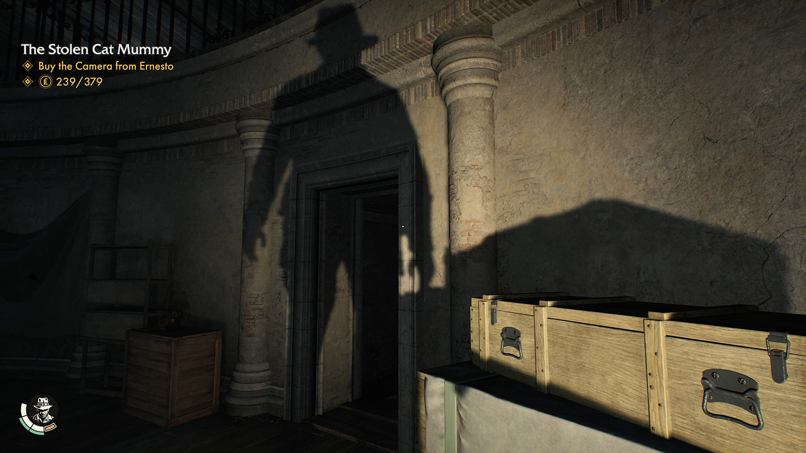 Carefully placed spotlights and torches regularly cast Indy’s recognizable shadow.
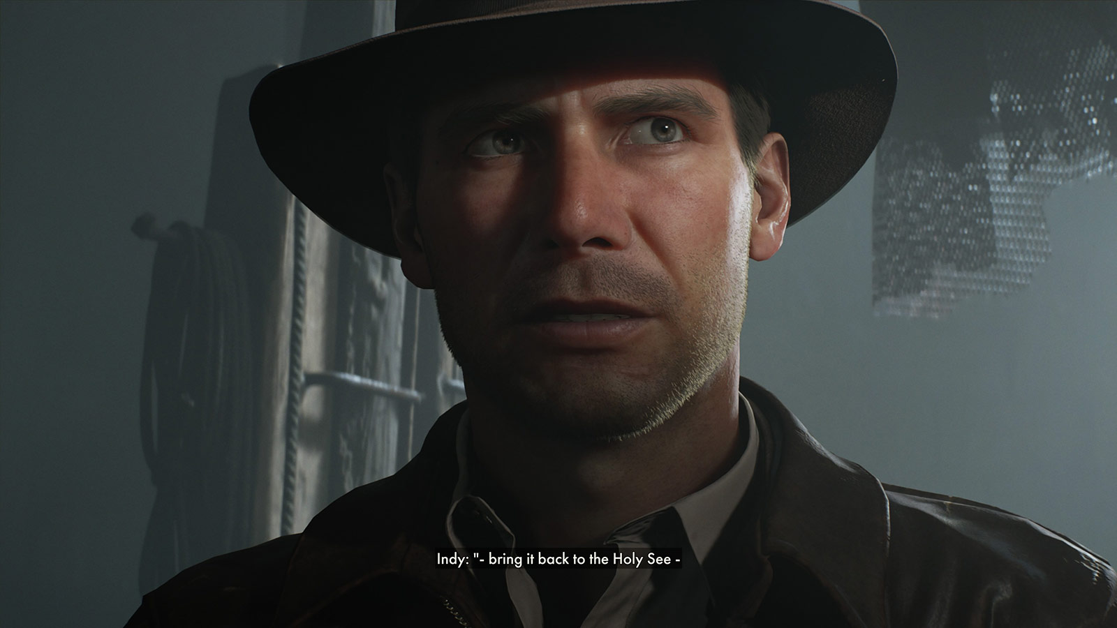 Light reveals Indy’s eyes when he’s making a connection or solving a puzzle.
 Open Kapitalen and Eurostile Extended welcome you to new regions and lend film authenticity.
Choosing a mostly first-person adventure also seemed like a big development risk. For an iconic character like Indiana Jones, it’s definitely a choice to not show him for large swaths of the game. To make it convincing, they had to lean hard into what it would be like to be Indiana Jones. So much would revolve around what you can do with your hands and whip and items. Therefore, that in-game system had to feel very comfortable to use and be pretty extensive. I had played a few previous Indiana Jones (and of course, Tomb Raider) games which were all third person, so going in, I thought first person would be weird or off-putting, but this game does it so well that I now prefer it over third person or over-the-shoulder views.
The developers clearly spent a lot of time studying the films. They picked up so many of Indy’s smirks, quirks, and mannerisms, and when combined with Troy Baker’s shockingly accurate voiceover work, you’d be surprised to learn it wasn’t voiced by and motion captured from Harrison Ford himself. The humor from the films is also ever present and used to great effect. Even beyond the dialogue, the yells, grunts, and exclamations all sound so perfect, capturing Indy’s intonation well.
What really put it over the top for me, though, is the music and sound. The game features a lovely and familiar score, threading John Williams’ original themes through new material in a way that sounds completely organic and unforced, rather than just quoting the Raiders March and calling it a day. Sound effects are also very much on point, with whip, punch, and gunfire having the signature cracks, thuds, and pops that seem right out of the films.
There are a few behind-the-scenes videos that go deep into all of this, and I watched them with a big stupid grin on my face. Hearing the development team talk about watching the films together, cataloging the core details that had to be right, and obsessing over everything clearly paid off.
It’s also just a gorgeous game. The id Tech 7 engine looks incredible on modern devices, rendering lighting and geometry in more detail than I’m used to in games (again, I don’t play a ton of games). The amount of just stuff to see in the levels is impressive. I can’t even imagine how long it took to set-dress all these areas. Notably, many of these items can be used as weapons or distractions, including wrenches, frying pans, mops, and bottles.
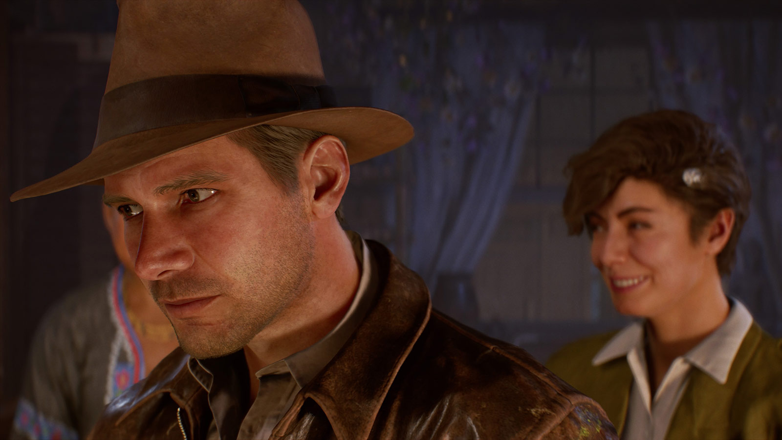 Just marvel at the level of detail achieved here: The fine individual hair, the wear on the seams of the leather jacket, the distressed fur felt on the fedora, and the specular highlights on the sclera of the eyes.
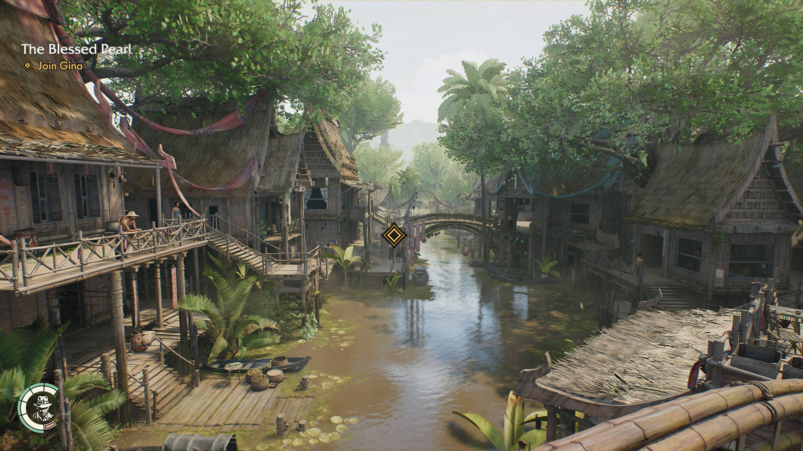 Every region has loads to explore, little sub-plots to follow, and NPCs going about their business. Some casually relay details or hints towards as-yet-unsolved puzzles.
Gameplay
The game heavily encourages you to lean on Indy’s punch and whip maneuvers rather than using his revolver. Ammo isn’t something to be spent carelessly. Rather, you save it for the moments when you get into a jam that’s larger than you can otherwise take on. But the cost of using a loud weapon is that nearby enemies will overhear it, blow the whistle on you, and rally reinforcements, so you need to pick and choose your battles carefully rather than playing it like a run-and-gun first person shooter. While not a stealth game, climbing, disguise, distraction, and a healthy dose of hand-to-hand combat will get you further than running headlong into battle. Certain classes of enemies will also see through your various disguises and similarly call attention to you, so you need to be aware of who’s nearby.
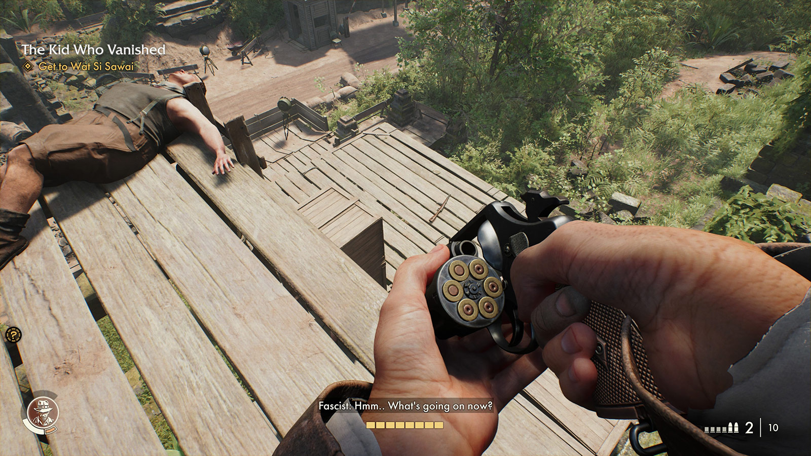 Attention to detail is everywhere in this game. Here, the number of remaining shots in the heads-up display corresponds to the number of visibly unfired rounds in the revolver. The reload animation has Indy individually pluck out spent rounds and replace them, rotating the cylinder for each.
The game balances exploration, discovery, collection, puzzle solving, and storytelling well. I rarely found myself spending too much time doing any one of those activities. The puzzles aren’t particularly difficult, with key items often just in adjacent crawlspaces, but they’re also not too simple. They feel calibrated to make you think, but aren’t so onerous that they impede advancing the story.
Along the way, you pick up money, bandages, food, local maps, and Adventure Books that expand your capabilities. The books are the game’s skill system, where you can improve your abilities like reducing reloading time, increasing damage dealt against enemies, or boosting climb and run stamina, and finding them is a nice reward for exploration. Once learned, they make future encounters progressively more achievable and boost your confidence to take swings at more aggressive confrontations. Indy is a scholar and a problem-solver first, so getting better at the job through research feels like the right approach.
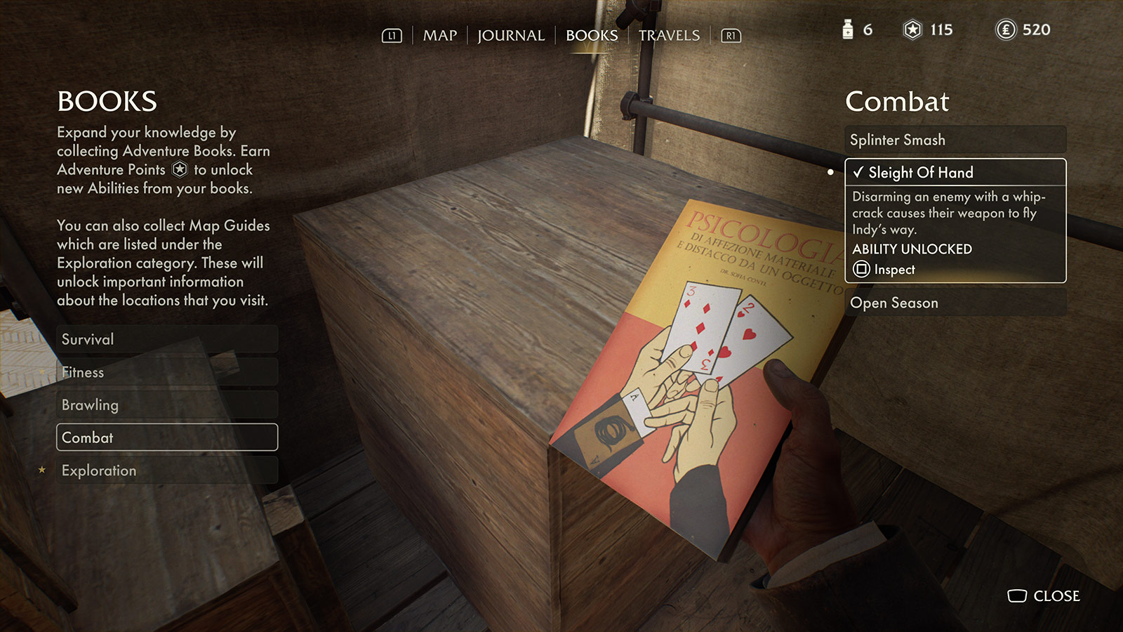 Acquiring and reading Adventure Books boosts combat, survival, brawling, etc.
 Even the Pause menu looks like it belongs. Also, hey, it’s me: I’m
 mac_minded on PlayStation and Mac Minded on Xbox.
That Belongs in a Museum
The Order of Giants DLC is a worthwhile addition, though it left me wanting even more time in this world. What MachineGames accomplished here is astounding. Licensed games based on beloved properties like Indiana Jones have a history of often getting surface details right but missing what actually made the source material work. This one didn’t miss. It understood what Indiana Jones is about well enough to make a game that genuinely belongs on the same shelf as the films. I don’t know if it will happen, but I would very much love a sequel.